


Major Cineplex
—
UX/UI design
Personal project
December 2018
Major Cineplex is an app for users to booking and purchasing a movie ticket on the go. Users can also redeem any partner’s promotions in the same way they would at the box office.
Project Background
During my new year’s holiday week, I wanted to watch a blockbuster movie at the cinema (personally I rarely watch movies at the cinema). I started booking the ticket through the cinema’s app, but I couldn’t find a wanted movie. Moreover, the interface was complicated, and the information was disorganized.
Goal
Identifying problems to improve a movie ticket booking experience and redesign the troubled screens.
—
Disclaimer
This project is based on my research only. I am not affiliated with Major Cineplex Group. I admire their works and hope this case study could be a good opportunity to improve further.
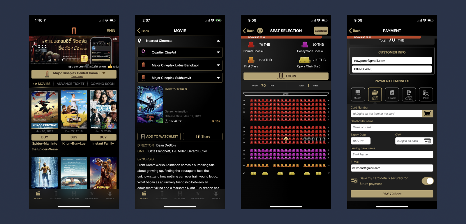
Current screens

Guerrilla Testing
To collect more data and user perspective, I conducted user interviews remotely that focused on the experience of browsing and booking a movie ticket. I interviewed 5 Major Movie Plus app users ranging in age from 22 to 30. I assigned a few tasks to get a movie ticket on the existing app and observe their interactions.
System Usability Scale (SUS)
Following the interview, I gave them a System Usability Scale (SUS) test to measure the current app experience. In conclusion, the SUS score was 55.5, which is a grade F that is below the average.
(Reference: The average score is 68)

The SUS score is 55.5 that I got from the interview.

Key Insights
According to the user feedback from the interview and analyzing the application flow, I captured key insights and problems that existed in the current movie ticket booking experience.
Key Findings Conclusion:
• Users didn't seem aware of the cinema location changing based on nearby that causes users were unable to find some movies.
• Now Showing list was unsorted that lack of searchability.
• Lack of “Favorite list” to collects user’s frequent cinemas.
• Inconvenience to browsing showtimes and seats.
• Packed information and unorganized UI components.
• Time out before processing the promo code at the purchasing state.
Later that, I synthesized the research into a behavior-based user profile to capture user needs and goals.
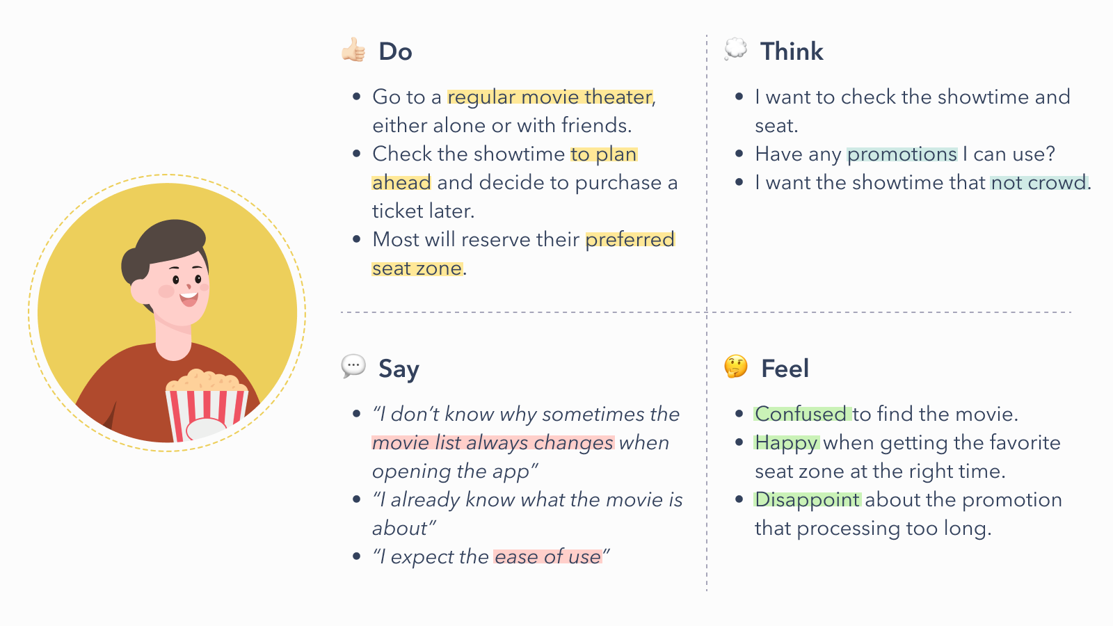
A behavior-based user profile

Solution
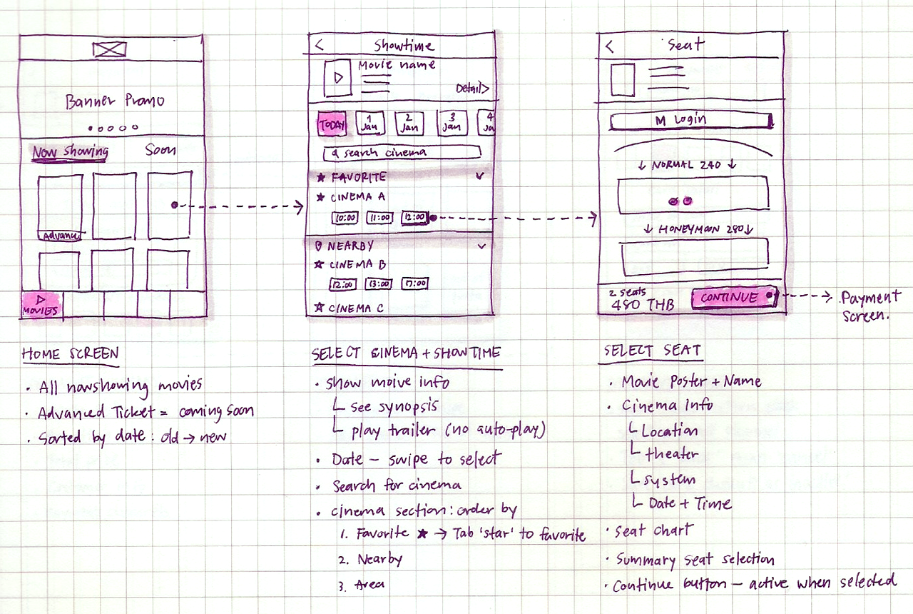
The overall app had both UX and UI issues. I optimized the user flow by creating a simple flow of browsing movies in which users select a movie first, then select a cinema and showtime—this flow was similar to the user's mental model.
In addition, the UI has been redesigned to be more consistent and organized information according to the visual hierarchy.

An optimized the user flow


UI Design
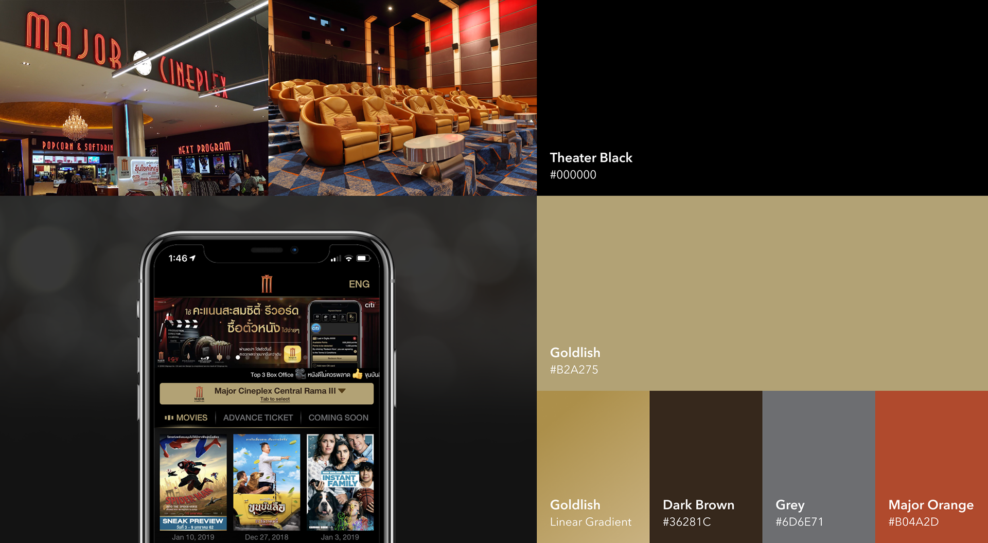
Keeping with their brand style guide, I designed the UI to feel like the box office and use a gold color to feel premium following their brand design principles.
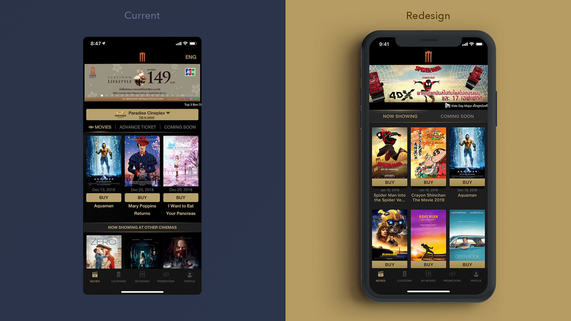
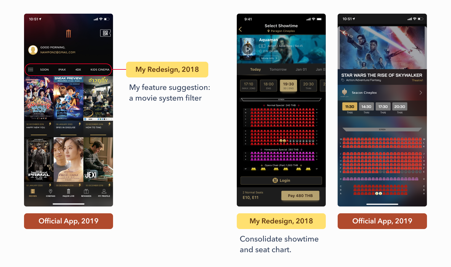
1. Home screen simplified
Remove the location-based filtering that prevents bookings from the wrong location by accident. The new design was listing movies in the gallery view, sorted by release date, helps users remember which movie was recently released that improve searchability.
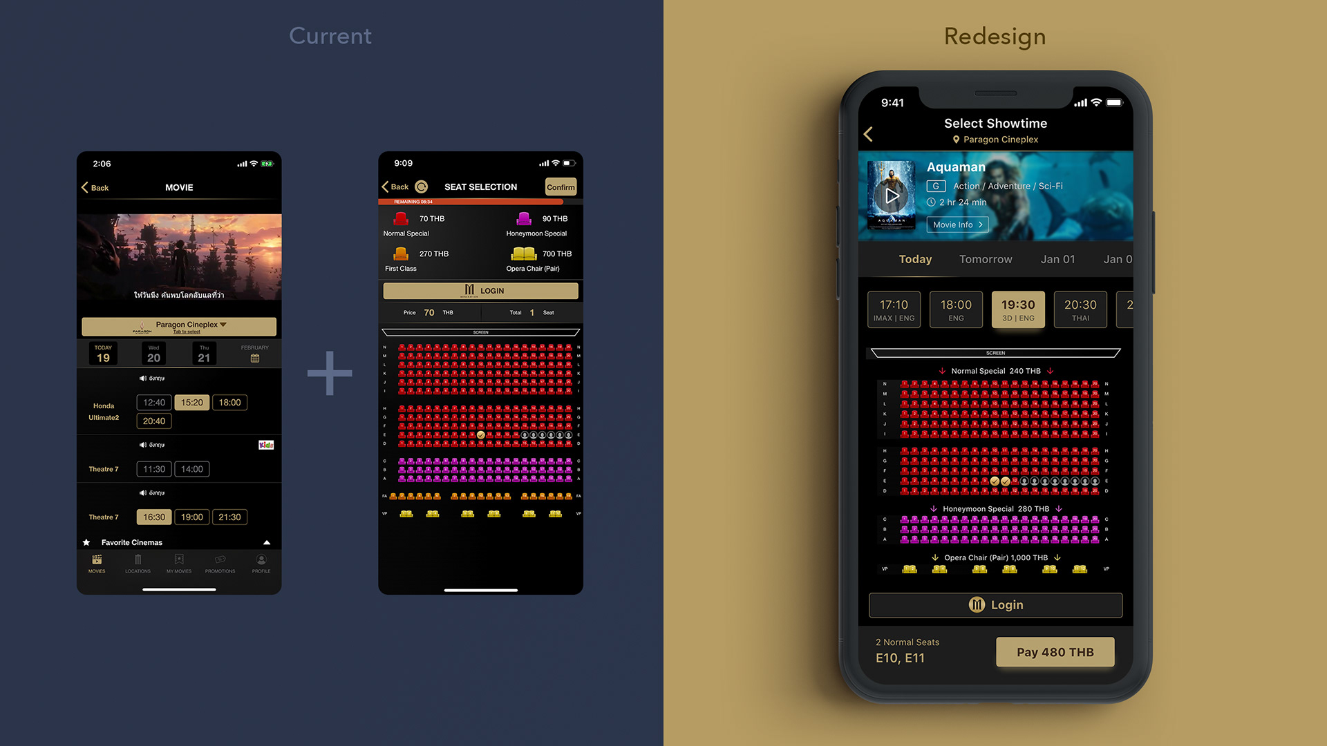
2. Peek available seats faster.
Consolidate the showtime and seat selection together. It facilitated switching to another showtime if the user’s preferred seat zone wasn't available. I placed the price above each type of seat that could save screen space. Lastly, at the bottom of the screen, I summarized the total price and put the "Continue button" in a reachable area for one-handed use.
3. Tidy up the order detail and payment methods
Because this page was long, I used the movie info the same as the seat selection screen to maintain consistency which reduced waste space.
I made the total price stand out and set the fixed position at the top when users scrolled to the payment method section. Lastly, simplified the payment form and increased the size of the pay button.


The impact of new design
I used Adobe Xd to create a clickable prototype and Maze.design for remote usability testing.
I tested the final design with another 5 users and did the System Usability Score (SUS) after testing to compare the result before redesigning.
Yeah! My redesign increased the SUS scores to 81, which is a grade B that is higher than the average.

The prototype
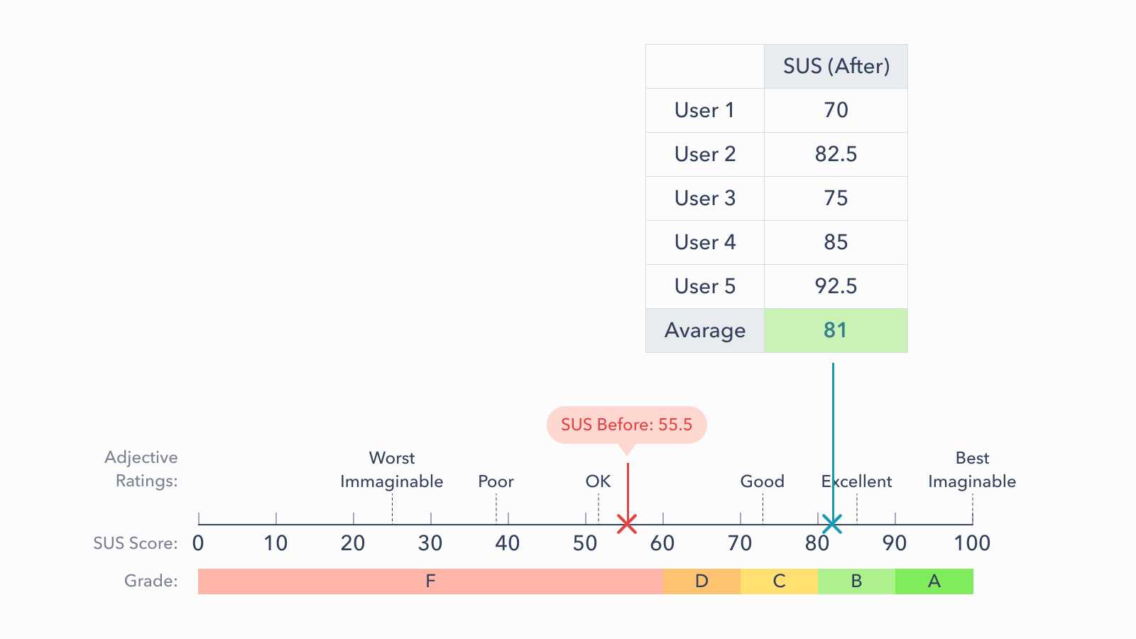
The SUS score after redesigning.

Next Step
My redesign is only a prototype. There is still room for improvement. Based on my research, I'd like to recommend potential features for a future version:
1) I would develop a "Movie system filter" to facilitate users finding movies available in a different system such as IMAX, 3D, or 4DX.
2) To increase the sale of snacks, I would add "Add Popcorn & Beverages" to the Ticket Checkout page. To facilitate users buying popcorn and drink faster.

Latest Update
In August 2019, The official app was redesigned after I proposed this case study in December 2018.
I was surprised that the new version includes some features that I discovered during my research. I'm so glad because it means I analyzed the research correctly.
Some screenshots of the official app (2019) that has same features as my project.