

K PLUS
—
Design System
KBTG
July 2020 - 2022
Due to banking confidentiality, I am unable to display exact visual designs, but I provide detailed descriptions to highlight my work.
Background
I joined the KBTG in June 2020 as an in-house UX/UI designer, responsible for all design aspects of the K PLUS mobile banking application.
K PLUS is a leading mobile banking application in Thailand by KASIKORNBANK, offering users a seamless, secure way to manage their finances and conveniently access banking services.
Since the app's interface redesign in 2017, the team has continued to evolve, focusing on enhancing user experience, convenience, and security for both personal and business banking needs. I joined the design team at the early stage of transitioning the design workflow from Sketch to Figma, where I am responsible for managing and governing the workflow and ensuring design quality.


Understand team workflow
I started by analyzing the team's workflow—how requirements were gathered, the design process, and the delivery of assets to developers. During this evaluation, I identified several key issues that were affecting productivity and quality. These problems spanned across design, development, and business perspectives:
Designer perspective
• Inconsistent communication during design handoffs, leading to time-consuming back-and-forths with developers.
• Some components had been updated over time (since 2017) without proper documentation, resulting in mismatches between design files and production.
• Some components had been updated over time (since 2017) without proper documentation, resulting in mismatches between design files and production.
Developer perspective
• Limited collaboration with the design team, leading to misalignment.
• Each sub-team implemented the same components independently, even though they were intended to be shared, resulting in inconsistencies across the product.
• Over 100 features were in production, making it difficult to update or fix components across the entire system at once.
• Each sub-team implemented the same components independently, even though they were intended to be shared, resulting in inconsistencies across the product.
• Over 100 features were in production, making it difficult to update or fix components across the entire system at once.
Business perspective
• Different product squads followed inconsistent design patterns, leading to a fragmented user experience.

Challenge and Considerations
Faced with challenges across multiple teams and a complex system too large for quick fixes, I collaborated with my team to develop a structured plan. Together, we prioritized both short- and long-term goals, deciding to focus first on creating a robust design library. This would ensure the design team could deliver work more consistently.
Our hypothesis was that improving design accuracy would help reduce system-wide inconsistencies. With the team's transition to Figma, building a solid design library became the logical first step.

Audit and clarify design patterns
With over 100 features and 1,000+ screens in K PLUS, I first delegated tasks to the team. I audited designs in Zeplin and Sketch, comparing them to the production environment to identify used and unused components and patterns.
We consulted with business teams to understand the rationale behind these patterns, and then worked with developers to determine whether components were global or specific to features. This informed our decisions on consolidating similar components into unified UI elements.

The sheet logs components from the audit process.

Balancing New System with Legacy
In building the new Design System, I used the audit data to establish a foundation based on existing legacy elements, including colors, fonts, spacing, and icons. While creating reusable components and K PLUS-specific templates for easier use, I had to respect the legacy system, implementing changes gradually to avoid disrupting current features. Each new component was designed to handle real content—supporting text, images, and icons—ensuring flexibility and compatibility with both new and legacy elements.

Documenting is a key
The primary purpose of the documentation was to serve as a reliable reference for the design team throughout the design process. Additionally, we serve this document for business and development teams, making clear usage guidelines essential.
We chose to document on Figma due to the security requirements of the banking sector, as other documentation tools had not yet passed policy approval.


Currently, my team has published 80% of the design library on Figma, with the remaining components still under development. The development teams are also implementing common components according to our agreed design system process. Our next goal is to finalize and solidify the design system for K PLUS, one of the leading mobile banking applications.

Some parts of K PLUS Design System on Figma
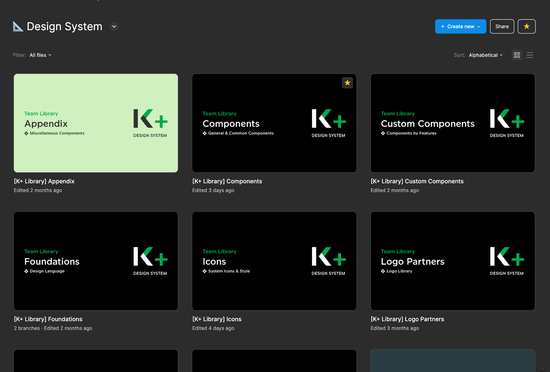
Separate files for a massive library